When I joined Easymeds, the problem was never about visual design. The real issue was much deeper — the product was difficult to use, difficult to trust, and even more difficult to scale as a business.
Easymeds had already entered the market, but the product experience was working against the business itself. Users struggled to understand how the platform worked, transactions weren’t happening consistently, and the web application lacked the clarity needed to convert users into paying customers. The structure was fragmented, information architecture was unclear, core flows were redundant, and navigation created confusion instead of confidence.
This was not a UI problem. This was a product problem.
Approach
Information Architecture
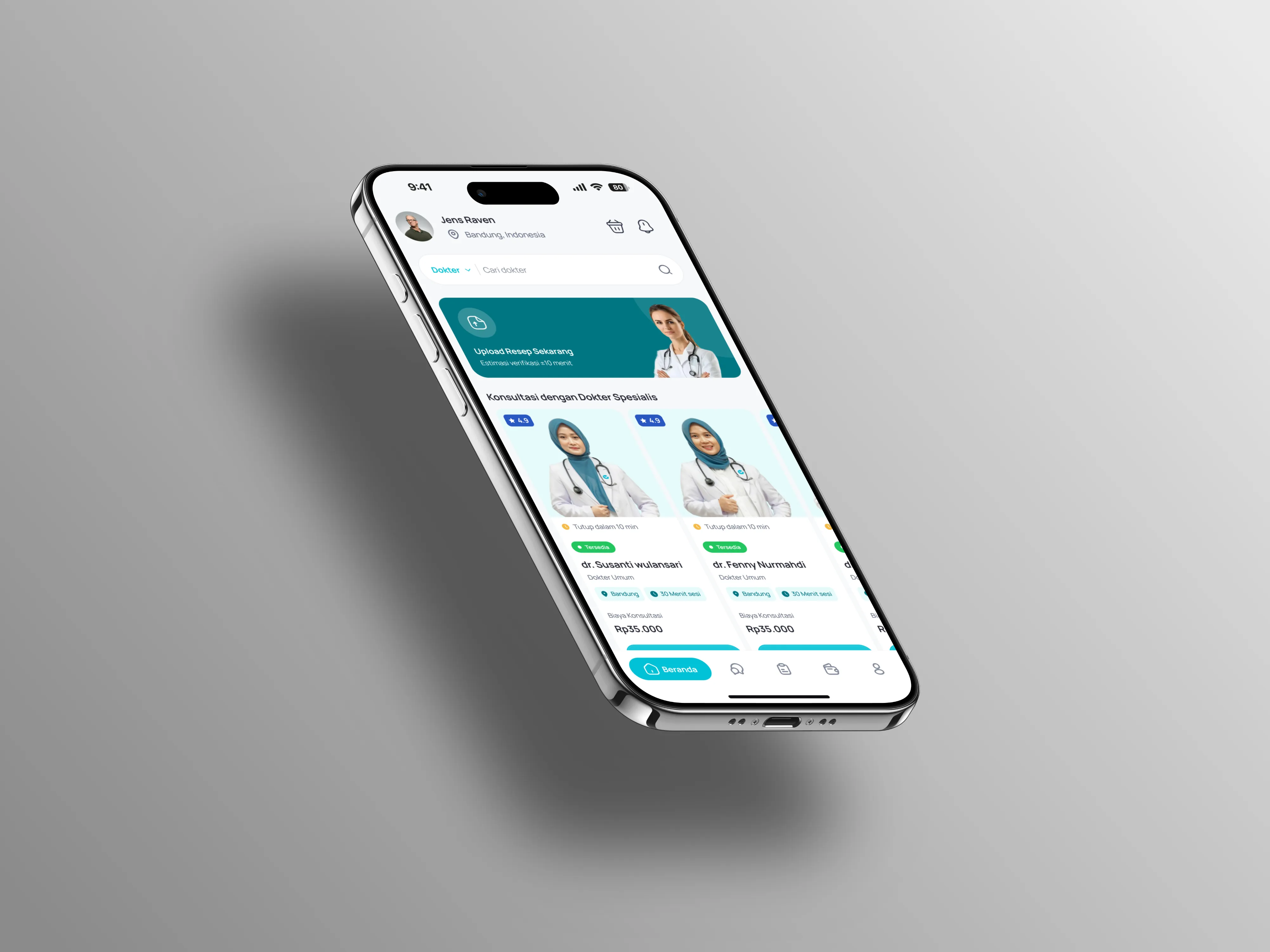
I restructured the IA by prioritizing decision paths instead of internal business logic. The platform was redesigned around user intent: finding doctors, understanding services, booking appointments, completing payments, and managing consultation history.
Product Flow Optimization
The consultation and booking journey required the most attention. I redesigned the flow to create stronger continuity: Doctor discovery → schedule visibility → appointment confirmation → payment → consultation history. Each step was simplified to reduce decision fatigue and increase completion confidence.
Designing for Business
By simplifying conversion points and clarifying service value, the product became easier to monetize. The payment flow felt more trustworthy, the consultation process became more understandable, and the business model itself became easier for stakeholders to defend internally.
The Problem
The existing platform suffered from a common but dangerous issue: it was built feature-first, not experience-first. Users dropped before reaching transaction points because the journey itself created resistance. No strong sense of progression, no clear user confidence, no reason to return. Transactions were low, retention was weak, and the platform struggled to establish a clear monetization structure because the product itself did not support the business model.
Key Outcomes
Stakeholders approved decisions faster — product direction became clearer and more defensible
Development became more efficient — flows were structured logically, reducing implementation ambiguity
Transactions began to happen more consistently
The platform started behaving like a real product instead of a disconnected system
Key Takeaways & Reflection
"Senior product design is rarely about making things look better. It is about making products work better. Easymeds taught me that real product design lives in structure, prioritization, and restraint. The most valuable decisions were not the screens I added, but the confusion I removed."